11 Underused Bridal Color Combinations That Exude Quiet Luxury
A curated selection of unexpected bridal color pairings offers a fresh approach to wedding aesthetics, blending rich tones with modern sophistication. These combinations prove that elegance doesn't have to follow predictable patterns, providing brides with alternatives to conventional wedding themes.
The Philosophy Behind Expensive-Looking Color Palettes
Luxury in bridal color schemes emerges from thoughtful pairings of deep, light-absorbing tones with luminous or grounding accents. This creates a balanced, high-end feel that appears intentional rather than accidental. The most successful combinations work because they carefully balance temperature, ensuring the palette feels fresh rather than flat.
Muted and monochromatic pairings provide sophisticated, "quiet luxury" looks that stand apart from more common wedding color schemes. The truly expensive appearance comes from selecting a palette that authentically reflects the bride's personality while maintaining a cohesive, considered aesthetic.

Breaking Away from Predictable Wedding Themes
Many brides reach a point in wedding planning where they realize most color combinations look familiar and safe. These conventional choices often fade quickly from memory. In contrast, the combinations featured here feel different—they appear considered and belong to someone who knows exactly what she wants, even if she can't fully articulate it yet.
These color schemes cater to brides who don't want loud trends but desire presence—the kind you feel before you fully notice it. They occupy a space of quiet luxury, offering unexpected yet underused alternatives to traditional wedding colors.
Detailed Color Combinations
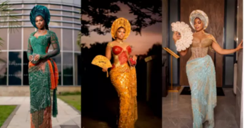
Teal and Gold: This pairing doesn't shout but glows with intention. Teal provides depth that absorbs light, while gold reflects it, creating a balance that signals luxury without flashiness. This combination appears frequently in high-end interiors and formal eveningwear because it photographs beautifully and maintains richness under various lighting conditions.
Plum and Forest Green: These colors offer presence rather than softness. Plum brings richness and quiet sensuality, while forest green provides grounding stability. Both colors connect to nature while carrying visual weight, working particularly well with deep florals and textured fabrics like satin or velvet.
Periwinkle and Peach: Deceptively simple, this combination balances periwinkle's cool, airy calm with peach's gentle warmth. The harmony between cool and warm tones creates freshness without feeling forced, resulting in a subtle yet memorable palette.
Ivory and Pistachio Green: At first glance safe, this pairing reveals sophistication upon closer inspection. Ivory provides timeless elegance, while pistachio green adds just enough freshness to shift the mood. Working within a light tonal range while offering subtle contrast, this combination feels clean, breathable, and quietly refined.
Rust and Emerald: This weighty combination pairs rust's warm, earthy tones with emerald's cool, jewel-toned richness. The intentional contrast creates a palette that feels both grounded and elevated, balancing warmth with richness for sophisticated results.
Marigold and Poppy Red: Designed for visibility rather than subtlety, this vibrant pairing layers marigold's celebratory golden tones with poppy red's energetic intensity. Both colors sit on the warm spectrum at different intensities, creating vibrancy without clashing, often appearing in cultural weddings where color serves as storytelling.
Navy and Cobalt Blue: This monochromatic approach creates depth through variation rather than contrast. Navy anchors the palette while cobalt provides movement, similar to viewing the same color under different lighting conditions. The sophisticated layering appears expensive without needing to prove anything.

Deep Purple and Champagne: Restraint defines this elegant pairing. Deep purple carries quiet drama, while champagne softens everything with light that avoids starkness. This balance between intensity and softness works particularly well in evening weddings or ballroom settings where lighting plays a significant role.
Turquoise and Camel: This unexpected yet grounded combination pairs turquoise's cool, clear vitality with camel's warm structure. One color energizes while the other anchors, creating balance often used in destination weddings, especially in outdoor or earthy settings.
Rosewood and Teal: Avoiding brightness, this palette features rosewood's dusty, warm tones with teal's softened depth. Both muted colors photograph elegantly and feel more timeless than overly saturated alternatives, offering sophisticated subtlety.
Taupe and Brown: This minimalist approach combines taupe's soft neutrality with brown's grounded weight. Together they create composed depth that feels intentional and long-lasting, proving neutral palettes can be sophisticated when properly layered.
The Lasting Impact of Thoughtful Color Choices
Some color combinations impress immediately, while others grow on you quietly until you realize they've occupied your thoughts longer than more obvious choices. The most successful bridal palettes aren't necessarily the loudest or safest options, but those that feel substantial enough to build an entire wedding day around without losing their appeal.
These 11 color combinations offer brides alternatives to predictable wedding themes, providing sophisticated options that exude quiet luxury and timeless elegance. By balancing depth, temperature, and luminosity, they create expensive-looking results that remain underused in contemporary wedding planning.